Create a traffic heatmap from Google Analytics with R Studio

Without any objectivity, I state that SEO is certainly one of the most exciting jobs because the ways to approach it are so different. However, there is one common denominator to all the experiences that consultants and other cool job names ending with ” SEO ” could tell us: relationships with other professionals.
A first example comes to mind, from my experience as SEO in a web agency:
“The site goes online tomorrow! »
“… this tomorrow? »
“Yes! The devs just finished! »
“It’s not going to be possible, no. »
“We have no choice, the client has been chasing us for two weeks. We’re already late, too. »
The argument according to whom the “customer is waiting” is certainly one of the most difficult to fight because is most cases the client is waiting for good reasons. At least, when the date of a site’s launch is over, which, let’s face it, happens regularly.
Ideal situation: SEO is “ready”.
Let’s assume that the site is ready from an SEO point of view, that all the actions that had to be carried out were carried out. What could delay the choice of the date and time of release?
- The natural traffic on the site.
- A significant need for Googlebot exploration has been identified.
Unlike paid search which can be interrupted over a defined period of time, SEO does not allow as many freedoms. And even if a 503 response code could work while the new infrastructure is being deployed, the fact remains that SEO sessions will be impacted as well as Googlebot exploration.
One heatmap: multiple interpretations
So why not deploy the launch when traffic statistics / logs are at their lowest?
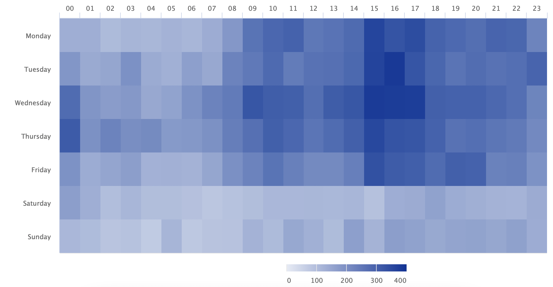
Building a heatmap to isolate periods of lower traffic simply minimizes the risks, to have a solid argument for both a Project Manager and a client.
In the case of a redesign, there is generally a greater crawl need in the following days.
We know that Google pays a particular attention to the site’s ability to handle so many bots at the same time. A patent is dedicated to this subject: Limiting web requests by web crawlers to a web host.
A system for balancing a web hosts load capacity among multiple competing web crawlers of a search engine receives from a plurality of web crawlers a stream of capacity requests for a plurality of web hosts. Each web host has an associated maximum load capacity—representing the maximum number of document requests that the web crawlers may collectively issue to the web host during each unit of time (e.g., a maximum number of requests per minute). For each pair of requesting web crawler and requested web host, the system creates a lease between the web hostand the web crawler. The lease includes an identity of the web crawler, an identity of the web host, a load capacity allocated to the web crawler and a scheduled time.
The combined affluence with users obviously has a greater impact. The heatmap can possibly identify a gap period that is more or less prolonged at the level of user sessions and which could therefore benefit bot exploration.
Building the heatmap with R Studio
Building the heatmap is relatively simple and will require the following packages:
- googleAnalyticsR
- dplyr
- tidyr
- highcharter
Before executing the code, you will need to retrieve the identifier of the Analytics view for which you want to analyze the data.
The code itself was co-authored by Mark Edmondson, Tim Wilson, Donal Phipps and Dr. Michael Levin.
# Start by loading the libraries we'll want to use.
library(googleAnalyticsR)
library(dplyr)
library(tidyr)
library(highcharter)

# Set the view ID that we'll be using. You can get the view ID for a specific view
# that you have access to by logging into the Google Analytics Query Explorer at
# https://ga-dev-tools.appspot.com/query-explorer/. It's the "ids" value.
view_id <- XYZ

# Authorize Google Analytics
ga_auth()

# Pull the data. This is set to pull the last 400 days of data.
gadata <- google_analytics_4(view_id,
                             date_range = c(Sys.Date() - 400, Sys.Date()),
                             metrics = "sessions",
                             dimensions = c("date","hour"),
                             max = -1)

# Added a column to the data with the weekday.
gadata$weekday <- ordered(weekdays(gadata$date, FALSE),
                          levels = c("Monday", "Tuesday", "Wednesday", "Thursday", "Friday", "Saturday", "Sunday"))

# Subset the data to just be the weekday, hour of the day, and sessions. (This
# means we're getting rid of the "date" column)
heatmap_data <- select(gadata, weekday, hour, sessions)

# Summarize the data by weekday-hour
heatmap_sums <- group_by(heatmap_data, weekday, hour) %>%
  summarise(sessions = sum(sessions))

# Now, "spread" the data out so it's heatmap-ready
heatmap_recast <- spread(heatmap_sums, hour, sessions)

# Make this "data frame" into a "matrix"
heatmap_matrix <- as.matrix(heatmap_recast[-1])

# Name the rows to match the weeks
row.names(heatmap_matrix) <- c("Monday", "Tuesday", "Wednesday", "Thursday", "Friday", "Saturday", "Sunday")

# Generate the heatmap of weekdays per hour
hchart(heatmap_matrix, type = "heatmap")
We have the following heatmap:

Now you have a strong counter-argument to put your point of view forward in the discussions.
What do you think?