Predict your break-even point with Google Data Studio

How to predict the day when you will be break-even: the moment where your revenue covers your total costs. The moment where you have no loss neither no profit.
In this article, I will guide you through the steps of visualizing both your costs and revenue on a daily basis to predict the day from whom you will start generating profit.
01. Inputs we need to calculate our break-even level
02. From our data source to Google Data Studio
03. How to drive growth
04. Grab your free template!
Data needed to calculate the break-even point
Calculating the break-even point is actually pretty simple, yet not used that much in data analysis. This information is very useful as it helps you manage your budget and then higher or lower your marketing expenses depending on the number of days left before the break-even level being reached.
In the following article, we want to predict our break-even level on a monthly basis. We need a few data to start with:
- Total costs: the sum of all the costs that must be paid this current month.
- Revenue forecast: we want to be able to see if the current revenue (month to date) is better or worse than our monthly forecast.
- Revenue: we could split the revenue depending on the revenue directly coming from our paid search campaigns and the one coming from our retention.
Data can come from various sources as long as Google Data Studio has a connector for it. In our example, we will use dummy data from Google Sheets to populate our fake revenue.
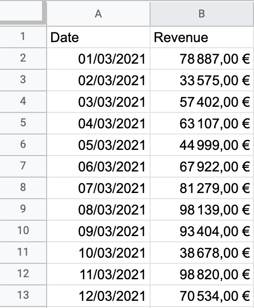
Our Google Sheets look like this:

In short, we only need a data source updated on a daily basis with the revenue from the day before to keep our Data Studio up to date.
Visualizing and updating data in Data Studio
Now, we do have our revenue. Yet, operating costs and revenue forecast are still missing: we want to create these fields directly in Data Studio.
First, we add our Google Sheets file as a data source in our Data Studio template by using the Google Sheets connector (how to connect to Google Sheets).
- We start by adding a Time series chart.
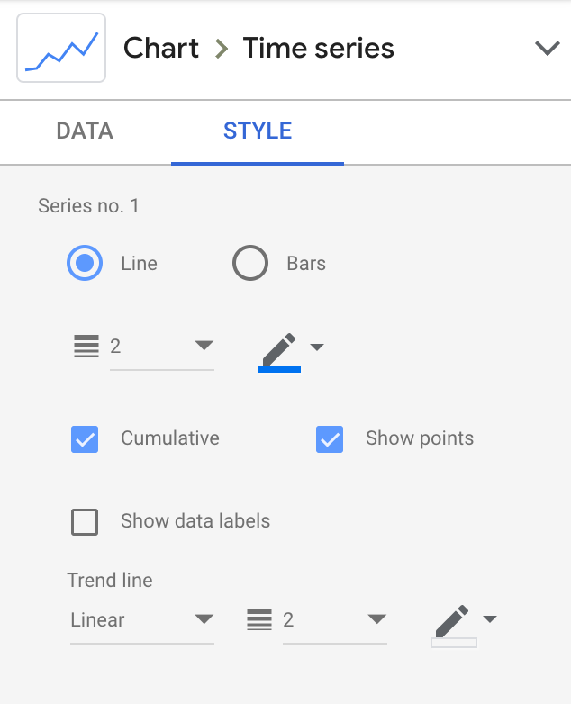
- We add Revenue as our only metric for now and then go to Style to tick both Cumulative and Show points. Then, we add a linear trend line.
- Then, we click on Add a parameter to add our monthly operating costs. We want to be able to update this total cost whenever we want directly on the dashboard, without having to go in edit mode.
- We then add our operating costs as our second metric on the graph. We also add a linear trend line to see our operating costs from the beginning of the month to the end of the current month.

We now need to add our forecast for the first draft of our graph to be over. Again, we add a new parameter and add 1.25 as a default value as we estimate our revenue to grow by 25% compared to last year. Then, we add a new field named revenue forecast as below:

We add our revenue forecast to the graph and tick cumulative and then linear trend to see our forecast until the end of the current month.
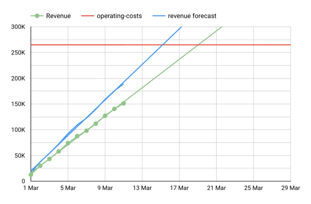
We now get our prediction: based on our forecast, our break-even point should be reached on March 15th and based on our current revenue (and linear trend) we should reach it on March 18th. After this day, we will start generating profit. As I said above, it is more interesting to split your revenue between your retention / MRR (monthly recurring revenue) and your acquisition (revenue you are leveraging through your marketing campaigns). That way, you will be able to take better decisions and once you have broken even, you can then stay conservative and grow your profit thanks to your retention only or increase your daily marketing budgets and look for more volumes and eventually more revenues.

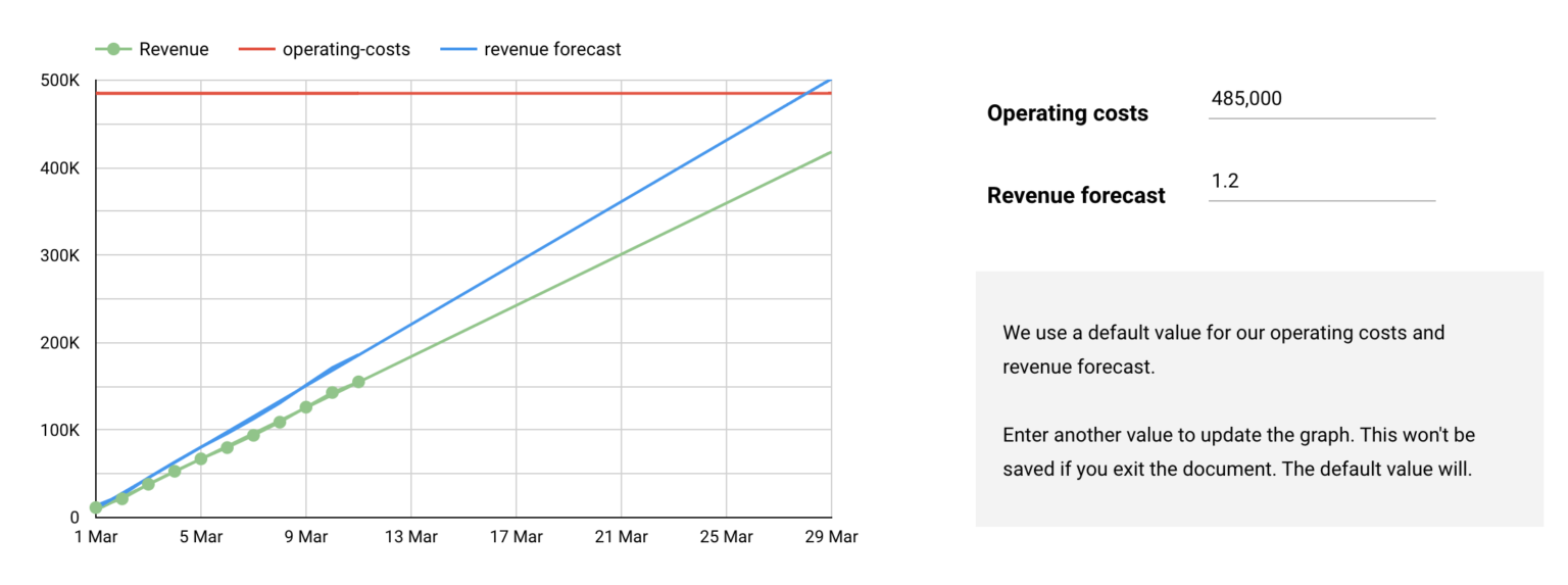
Let’s say your boss and boss’ boss want to visualize the break-even point and update it with their own data and predictions respectively about the operating costs and forecast: we are going to add input fields in order for this template to be updated without having to enter the edit mode.
There we go:
- We add two input boxes: one to update the operating costs value and the other one to update the forecast (click on Add a control and then Input box).

Growth x Finance use case
We, at Pictarine, are using this information to take better decisions whether we can accept to take risks or stay conservative regarding our marketing expenses. So our first takeaway is the ability to measure the risk we are willing to take.
What’s more interesting with our break-even point is that we can use it to better understand our growth revenue from month to date: it then help us to put a figure on the budget increase by network as a sort of subparent of a marketing mix model. In the end, the break-even point also help us determine the budget dedicated to our monthly tests.
Download the Google Data Studio template
You can make a copy of the template and share it on social media! Remember that I used a Google Sheets to populate data about the revenue. So you will have to connect another Google Sheets or even another connector to get your revenue data.
Also note that the default date range needs to be set on Custom > This month in order to visualize the data on a monthly basis (actually you can analyze on any basis you are more comfortable with). I set it on March 2021 on purpose as I won’t update the dummy data.